In Which I Attempt to Explain Responsive Images
October 31, 2020 📬 Get My Weekly Newsletter ☞
Getting responsive images to work via the srcset and size attributes to img is not easy, especially because
almost all documentation I have found is vague as to what exactly the word “pixel” means in any given context.
This post will sort that out.
Responsive in this context means to adapt to the screen the site visitor is using. Thus, responsive images means to show images based on that visitor’s screen.
The Problem
When we show different images based on different screens, we have a few problems:
- Different layouts for different screens — we might have an image take up 100% of the width on a phone, but only one third on a desktop screen.
- More device pixels than logical pixels — an iPhone uses 9 hardware pixels for one logical pixel.
- Images are displayed using device pixels, not logical pixels — a 300px-wide area will need an image of 900 pixels wide for a typical iPhone.
- Bandwidth is not infinite — the same iPhone users are likely on a slow network, and paying for each byte they use.
The Solution
While one solution would be to serve up a large image that looks great at all sizes and screens, this ends up requiring quite a large image. While we could use JavaScript to detect and swap out the image being used, most browsers now support new attributes on the <img> tag to manage this: srcset and sizes.
srcset is a list of all the images you have and how wide each one is in actual pixels. sizes is a map of breakpoints to widths. Those widths can be in percentages or logical pixels.
Wait, logical pixels!??!
A pixel is supposed to be the smallest unit of a display or image. Nothing can be smaller than a pixel and a pixel is drawn in a single color. The problem is that high-density AKA Retina screens—and the devices that use them—doing things differently.
Any high-density screen (hereafter, “retina”) has tiny pixels you can’t see. The operating system capitalizes on this to draw lines and curves that look crisp. But, on the web, the use of pixel-based dimensions (e.g. 500px) is so common that if your device with a retina screen rendered the exact number of pixels requested, everything would be super tiny.
Thus, a logical pixel (sometimes referred to as a CSS pixel) is what CSS deals with. My iPhone has a width of 414 logical pixels, though the physical screen uses 1,242 device pixels to render that.
This is fine except tons of documentation about CSS generally, and responsive images specifically, uses the word “pixel” without qualifying exactly what that means in context. And it’s actually really important to know which one we are talking about.
Images Map to Device Pixels
Let’s consider a 300 pixel wide image (in this case, the naked “pixel” really does mean its original meaning: an image that is 300 dots wide):
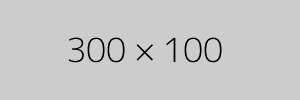
Let’s put that in a box with a width of 300px:
Let’s try this again, but with an image 600 pixels wide:

Notice how both images are the same width and the text is about the same size? Look at the text closely. The 300x100 image’s text should look blurry or pixilated on an iPhone or other retina display.
This is because our 300px box is 300 logical pixels wide. On my laptop, it’s actually 600 physical pixels wide. Because the image is only 300 pixels wide, the browser scales it up to 600 actual pixels to display it. Scaling up creates blur and pix elation.
Of course, if you are on a recent iPhone, even the 600 pixel image above will look blurry, because it is using 900 pixels to render that image.
How do we deal with this?
To deal with this, we need to know what size container holds our image at each breakpoint as well as a list of images at various widths. We’ll tell the browser what actual width our images are, what logical width the container would be at each breakpoint, and then the browser will figure out the actual number of pixels that container has, and match an image that fits.
Let’s say we have one breakpoint at 500px and thus two sizes: 500px or less and 501px or greater. Remember, these are logical pixels, not actual pixels. Let’s supposed that our design is such that at 500px or less, our image takes up the entire width. At 501px or greater, it takes up 50% of the width.
Let’s say that we have our image at three widths: 500, 1500, and 3000 actual pixels. Here’s what our <img> tag would look like:
<img src="/images/3000x300.png"

     srcset="/images/3000x300.png 3000w,
             /images/1500x300.png 1500w,
             /images/500x300.png   500w"

     sizes="(max-width: 500px) 50vw,
            100vw"
>
This says that our set of sources (srcset) is the three images listed, each of which has a width of the given number of actual pixels. It further says that the sizes we are using (sizes) is 50% width for screens 500 logical pixels wide or narrower, and 100% for the rest. Note that vw stands for “view width” and while you cannot use a percent sign here, the values are effectively percentages.
Let’s see it in action.

Play around on different screens and devices. If you are on a desktop browser, you can use your browser’s responsive design mode to simulate all this. Note that you must clear your cache each time because if the browser caches a larger image than needed, it’ll just use that. Sometimes.
OK, so how do I use this again?
There’s a few things that are annoying about this that you just have to deal with:
- Whatever breakpoints you have in your CSS, you have to recreate in each and every
<img>tag. - You have to specify the image widths even though they are part of the image because the browser would need to download the image to know the widths and one of the reasons to do this is to prevent the browser downloading an image bigger than it needs to.
- You need to decide how many versions of the image to create so that you are handling all the devices and screens you care about.
Here is my recommendation:
- Think of the lowest-end, smallest device you will support.
- Figure out the largest, most recent phone available (usually whatever iPhone Max is out, but some Android phones are bigger)
- Decide what type of monitor most desktop/laptop users have for whatever you are doing.
These three screens should give you a good breadth of sizes. Figure out what size your image will be on each screen, then use the screen’s actual pixels to figure out how wide the images must be to look good on those screens. Then make your images in all of these widths, and construct your <img> tag.
Just never use the word “pixel” without a qualifier again.