My first iPhone App - Part 3
June 29, 2010 📬 Get My Weekly Newsletter ☞
Just a quick update for tonight. I’m starting to get the hang of how the user interface elements I create in Interface Builder get hooked up and become available in code. It’s a bit odd and not terribly intuitive, but it’s starting to make a bit more sense. Under the covers there’s some sort of dependency injection going on (even if Apple doesn’t call it that) that smells of Spring-style magic; objects get created for me and populated if I do the right thing.
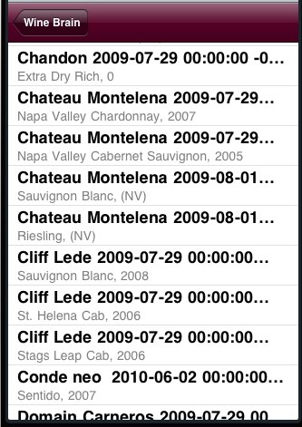
At any rate, I decided that, before making any more changes, I needed to get a reasonable data set into the app. I spent two painful hours exporting my Google Doc Wine Brain into CSV and parsing it with Objective-C, mapping it to my Core Data model objects. In the end, I was successful, but, WOW, what a pain compared to Ruby or Perl.
Seeing this large set of data on the home screen was very motivational to start working on a drill-down/search interface, as you can see here:
Before delving into my new homescreen, I decided to work up a better color scheme that was more “wine-like”. I’m not a big fan of apps that have fancy graphics and obscure the idiomatic iPhone UI, but a bit of a color splash would go a long way (and, not to mention, be well within my graphic design skill level). In addition, more user testing (via Amy once again) revealed that the rating control needed a much starker contrast between the selected and unselected choices. There isn’t much I have control over via the API for this, so I chose an alternate style of UISegmentedControl that used the “iPhone blue” for the selected state. I think it works OK with the color scheme, though I’d prefer the “merlot red” that I chose for the nav bar and wine type:
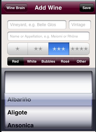
I’m starting to think that my desire to have wine entry confined to one screen might not pan out. The “slot-machine” control will become more and more unusable as more varietals are added, and there’s really no way to even add a new varietal here. I think I may have to go with the drill-down method where by I push another table view onto the stack to select (and possibly add) a varietal. For another day.
Lastly, I took a stab at a better home screen:
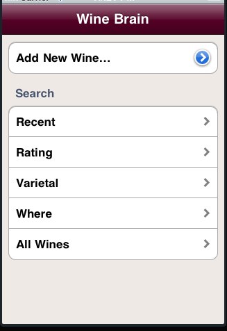
This pretty-well represents the ways I think I’d want to navigate the data. Time will tell once I implement these searches, but this seems like a reasonable start.
I also have to say that, despite Objective-C’s overall wackiness, it was pretty easy to put this together and have the “Add New Wine” button bring up the “Add Wine” screen and to have the “All Wines” button navigate to the old home screen. Apple has done a reasonable job of making it easy to make an idiomatic, normal-looking iPhone app.